From a lecture given to the British Art Medal Society at the Art Workers’ Guild, London, Saturday April 1st, 1995.
Not all of my works contain circles or have a circular format, but the circle has often been an issue in my art, whether as an image or symbol, or as a problem of composition. Since the vast majority of paintings have a rectangular format and the vast majority of works of sculpture are pinned down to their pedestals, the issue of composing within a circle and around a single dynamic centre probably must remain the preserve of the medallist. A quick count through the 1992 FIDEM catalogue shows that at least 85% of the medals illustrated adhere to a traditional circularity even if those same medals have largely abandoned the border or frame that the medal often shares with the other arts.
Just over half of my own medals have followed a strictly circular format. With the others, the form of the perimeter has been an integral element of the content or message. This can be seen most clearly in silhouette and is a bonus that the medallist can share with the monumental sculptor; a kind of fourth dimension that is denied to the painter. In this review of my work I want to show how the circle has appeared, reappeared and disappeared over the last 17 years. This entails going over a variety of media, themes, and styles, all of which lead up to the work I am doing now.
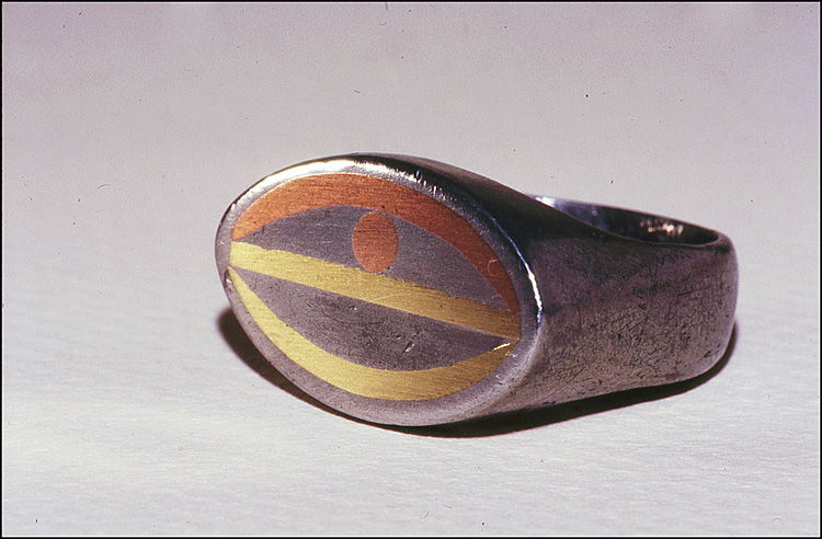
Pewter RingIn 1978 I was living near the Welsh border with an artist who worked in leaded glass. Using the scraps of lead and tin, the traditional ingredients of pewter, I was able to experiment with the lost wax technique. I had a copy of Oppi Untracht’s book, Metal Techniques For Craftsmen, and this ring, the only surviving piece from those times, shows one of the more elaborate techniques for cast pewter. The strips of copper and brass were fixed into the mould so that when the metal was poured they became fused with it.
Ink Designs
Some time later I started designing leaded glass panels for myself. I did dozens of these drawings on A5 paper, but when I started cutting glass I also began painting in watercolours.
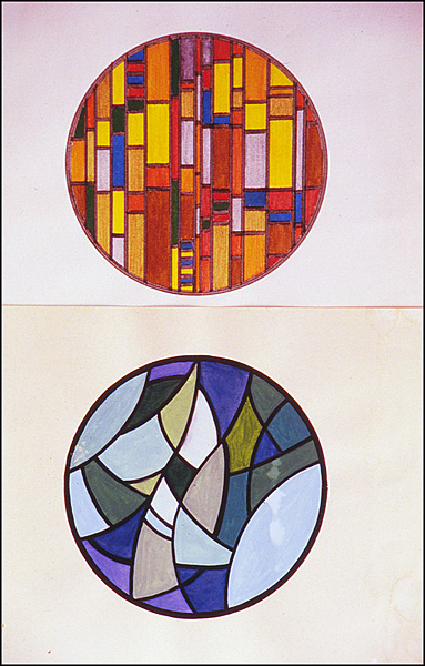
Untitled Watercolour
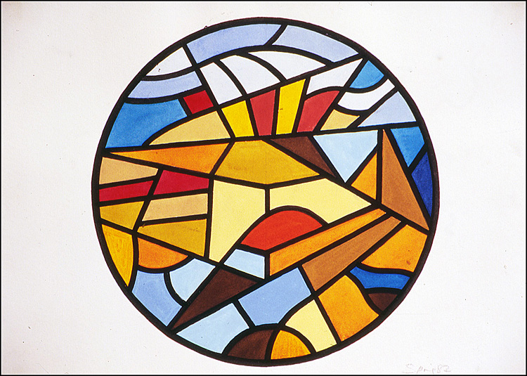
This was to the scale of the proposed piece.
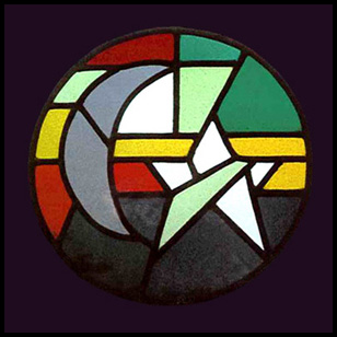
Moon and Venus
I made five hanging leaded glass roundels. Like the Moon and Venus, all of them had some element of astrological imagery.
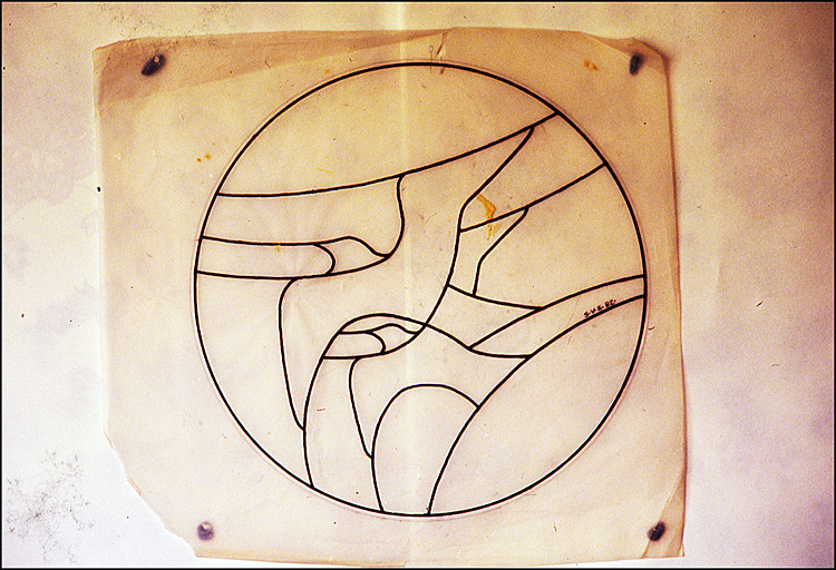
Two Birds
This is the cartoon for one of the roundels. The black line of the design represents the lead calm that bears the weight of the glass. It is not so important in a 30 cm panel, but good glass designs must have a strong element of verticality in them or else the glass will collapse.
Saturn Neptune
This was designed as a large fitted panel, and so there is also a horizontal division into three approximately equal sections.
Pluto Ascendant
After a while, perhaps inevitably, the work on paper began to take precedence over practical considerations and in Pluto Ascendant the black line became merely decorative. The only way out was to turn away from geometry and watercolour to oil paints and looser forms.
Chernobyl
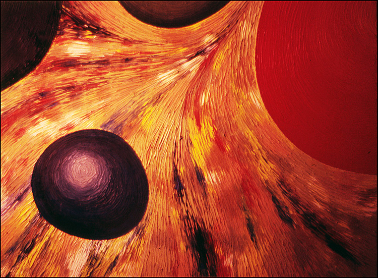
The oil painting was so named because it was done the weekend of the nuclear disaster. It was one of a series of paintings on hardboard that use circles, whether as eggs, suns, cells, flowers or whatever.
Element Structure
At times I used artists’ colours and knives.
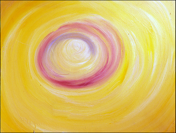
Yellow Vortex
At other times I would use just ordinary house paint glosses.
Plaster Mouth
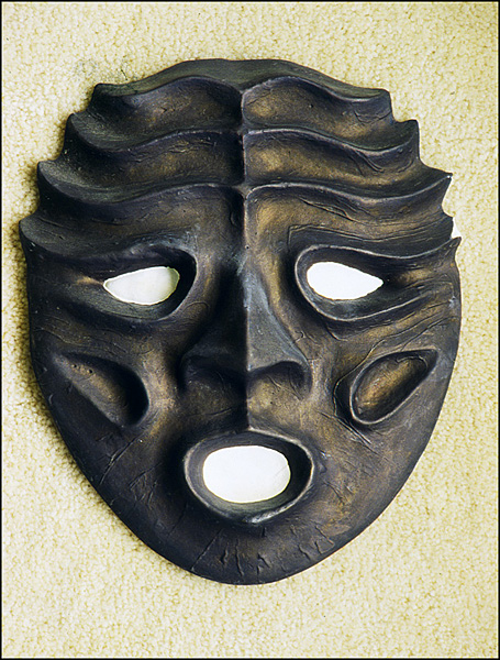
When I started my degree course in 1985, at what was then Cambridge College of Arts and Technology, I began sculpting again with clay and plaster making about a dozen of these masks. All were open mouthed, and a kind of neo-Gothic blend with Chinese Tao Tieh.
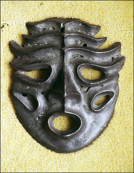
Lead Mask
When it came to casting, however, the results were far from perfect. This mask was a product of impatience.
Topless Bottom
Visiting the Contemporary British Medals exhibition at the Fitzwilliam Museum in Cambridge in 1986 was an eyeopener and my immediate response was to try for myself. One of the most arresting attractions of the medal was the potential offered by the twin, or contrasting images of the front and back.

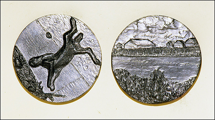
Dead Hare
During that summer I was working in an office near Ely and had to cycle six miles across farmland every day. The Dead Hare lying at the roadside was one of an endless stream of casualties trying to escape the harvesting machines, and, having worked as a combine driver myself, the image hit me fairly strongly. The area around Ely is as English as Constable, and so the contrast with death on the road seemed fitting for a medal.
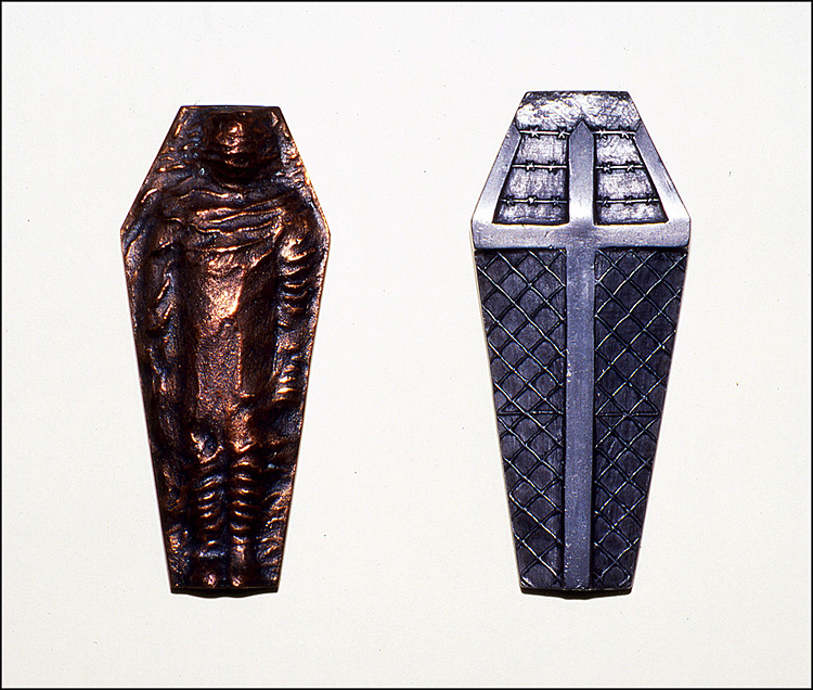
Medal to Commemorate the Victims of Apartheid
The third medal I made, Victims of Apartheid, was for the RSA Design Bursary Competition in 1986. As the word apartheid means 'separate', the image of the chain link fence and the cross seemed sufficiently clear, but the form of the bier and the shrouded body only came to me after seeing a photographic exhibition on township life. The silhouette or form of a coffin is unmistakeable, but for me, perhaps because one half of my family has always lived in South Africa, the form also implies a broken spear head, and therefore also refers to the cultural loss that Apartheid caused.
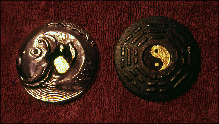
Universal Fish
However, the association of medal and circle is traditional, and casting around for seemingly suitable circular images I came across an oriental fairy tale of a carp that lives in the centre of the universe. The fish, with its tail to its mouth, was as circular an image as one might find.
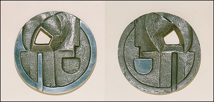
Cubist Token
The design relates back to some of the drawings I had done for the leaded glass roundels, in particular the problem of dividing a circle into angular sections, balancing the centrifugal and centripetal energies. The reverse is a negative of the obverse, though I'm no longer sure which is which.
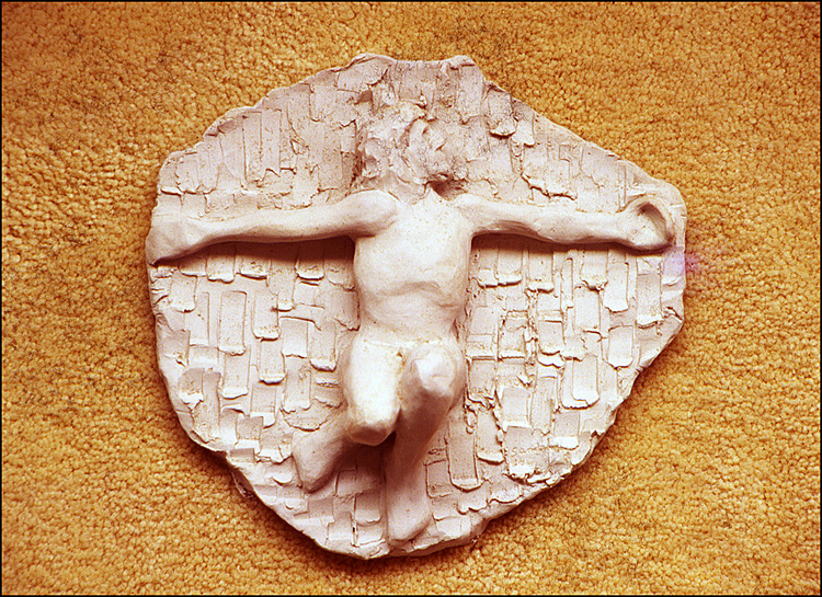
Crucifixion
For a while I left medals and wax aside to work in clay. The Crucifixion, knees bent against an artexed wall, is a relief, but the figure is modelled in the round, with the knees projecting outwards into the space of the room.
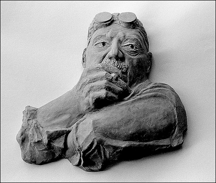
David Smith
Generally speaking I don't use pedestals with multi aspect sculpture and only use frames with medals and reliefs when I have a specific reason to use that kind of link with tradition. In this case the triangular format, coming from the relationship between the elbows and the welding glasses, is taken directly from the original photo.
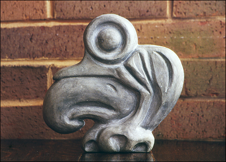
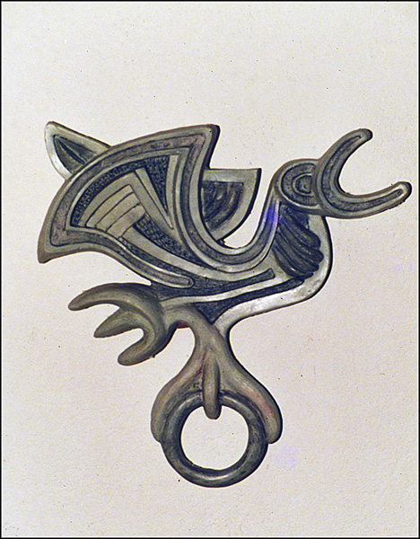
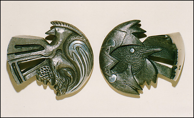
Scythian Bird
Most of my work during 1987 was larger than the college kiln would allow and so I began casting the clay in reinforced cement. Here, the medium turns a miniature 5th century BC. bronze bridle plaque into a lumpy 20th century creature.
Illusion-Delusion
In this relief I have tried to cram in as many images as possible. The large circle on the left is both a breast and an orange, as well as representing the Sun. The other is both Moon and cheese.
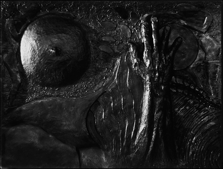
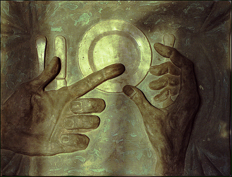
The Great Tablecloth
These reliefs measure 58 x 76 cm, and this was the last of them. The title comes from a poem by Pablo Neruda. The hands gesture in hunger above the empty plate, but it is also the finger pointing at the moon.
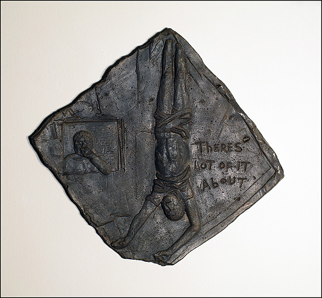
There’s a lot of it about: GM
Also a cement relief, but this measures just 27 x 27 cm. I avoided the formal square in order to hint at the idea of it being a fragment of life and death, which ties in with the graffiti. The figures themselves come from the doors of the Vatican by Giacomo Manzu.
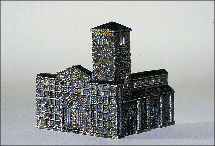
Church Prototype
I moved to Italy in 1989. When people get married in Italy, it's usual for the couple to give a small gift or memento to each of the guests. Some friends of mine were getting married in a small Romanesque church, San Vincenzo and Anastasio, and for their bombonniere I tried this ¾ view of the building. This would have had their names and the date of the wedding on the reverse panels.
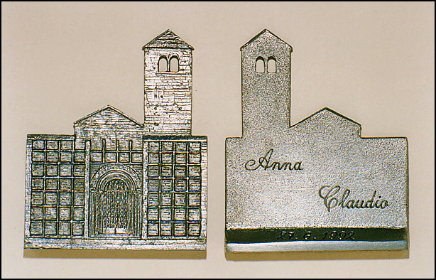
San Vincenzo and Anastasio
I opted instead for a medal that stands on its base and cast 90 of these in pewter and had three cast in sterling silver.
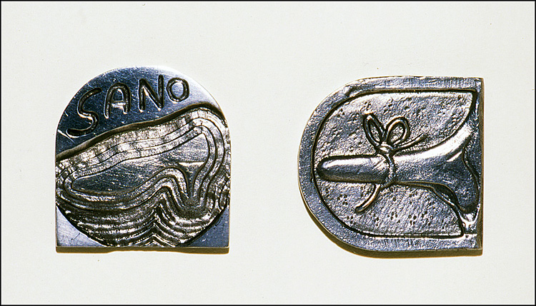
A Good Soul is No Heel
The outline form of the medal describes the heel of a shoe. The medal was requested as a gift for the official opening of a shoe shop and for some reason I was asked to put a nose on one side. I don't know why, but it did give me a new form to work with by making the nose the pin of a buckle. The word 'healthy' is sano in Italian, which is an anagram of naso, meaning 'nose'. The title in Italian, Un Tacco Sano e un Toccasana implies it is lucky to have a good heel on your shoe, but it possibly makes more sense just to translate the style of the phrase as A Good Soul is No Heel. The shoe shop never opened.
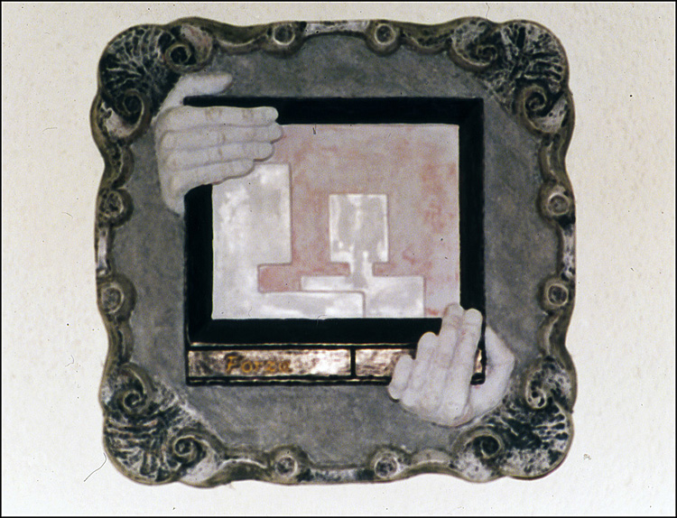
Culture Shock (Memento Mori)
In 1992 and '93 I did two more reliefs in cement. Culture Shock, with its sub title Memento Mori, is a comment on cultural degradation, with the television manhandled through the eroded picture frame. It was inspired by the assassination of two leading Italian figures, but its relevance is not meant to be limited by geography. The word Forza, which I have used for the brand name of the television, is an exhortation meaning 'have courage' or 'go for it', but this was a full year before Berlusconi used it as the name for his political party.
Cry For Liberty
I'd cast several birds in pewter, another of my obsessions, so naturally I couldn't resist making another bird in cement. At home I have a copy of The Linnet by Karel Fabritius, and I find the idea of the song bird held captive to human vanity a moving and compelling image. Oddly enough, the ring that chains the bird seems to act as a pedestal, but the whole piece hangs on the wall.
Not Twins
One advantage of not using a border to frame the image, and of course, of breakinq out of the circle, is that of building one form against another. Here, the heads of the birds share the same outline, but the wing tips of one become the talons of the other. This ties in with the idea behind the medal, as I wanted to illustrate both the differences that can exist within a species, as well as the similarities that can hold very different creatures together.
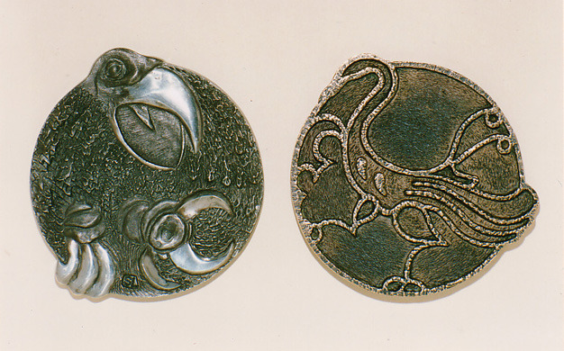
Ab Ovo
Ab Ovo echoes the same divergence. On one side the bird is naturalistic, pushing its head and young feathers past the fragments of shell, while on the other the bird is in profile with wings that are wholly different from each other; geometric and flowing, or Abstract and Surreal, however one may choose to view them. With a broad polished end, the medal has almost three sides.
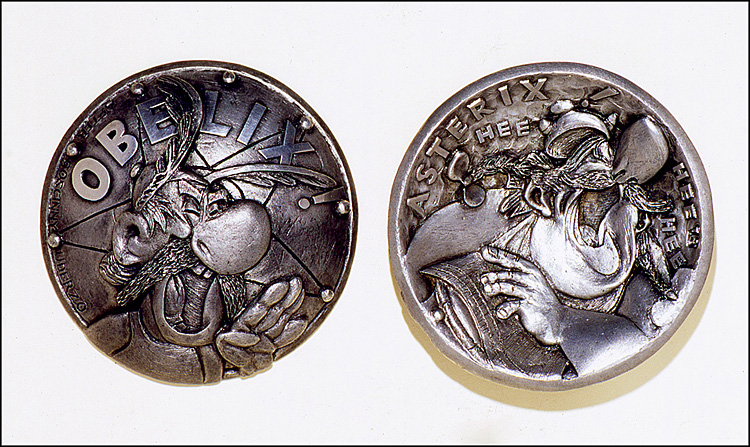
Asterix and Obelix
I've been a fan of Asterix for some twenty years, and if any portrait medallist should pick up a copy of Asterix and the Soothsayer I am sure they will see why I found the drawings of Albert Uderzo irresistable for rendering in relief. The form of the medal describes the shield of Vitalstatistix, the village chief on the obverse, and the cauldron of the Druid Getafix on the other side. It was these elements, in themselves subjects of different stories, that gave rise to the convex/concave shape of the medal.
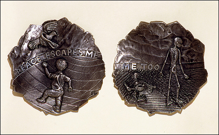
No Peace
I began the medal No Peace at the start of the conflict in Ruanda in 1994, while, of course, the tragedy in the ex-Yugoslavia was still an ongoing story. The undulating shape of the medal and the sharp edge were chosen to suggest a jagged fragment of bomb casing, twisted and torn by the force of its own explosion.
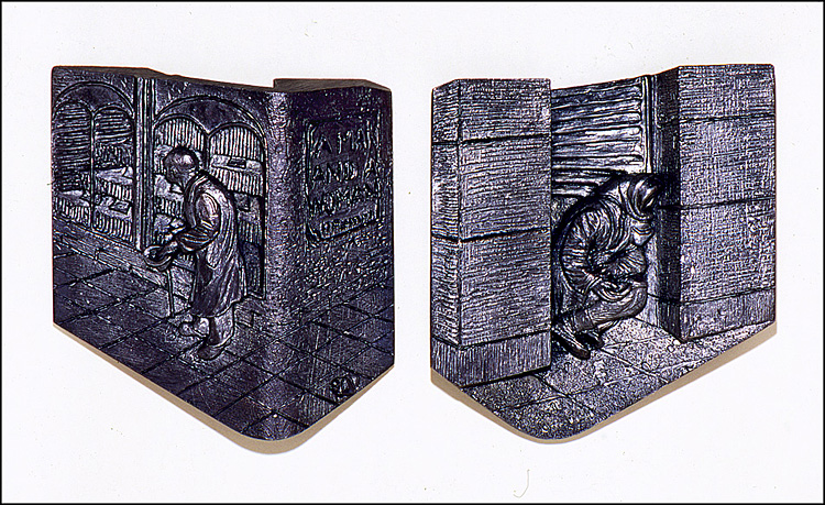
A Man and a Woman
The title comes from the film by Claude Lelouch and appears as a poster on the wall, around the corner from the man. There has been an enormous increase in the number of refugees and beggars in the last seven years all over Europe, and in fact this medal was made from photos I took in 1988. The form of the medal was dictated by the architecture, as very often people on the streets take up an almost theatrical pose, especially under the grandiose porticos of northern Italy.
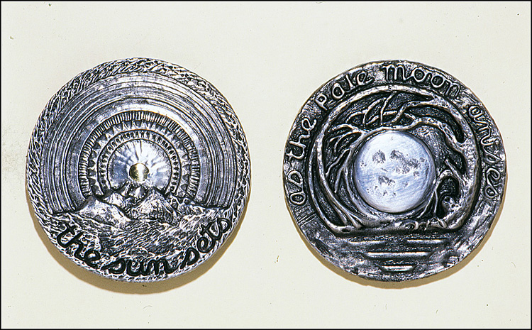
Full Moon
The circle makes its return, in part perhaps because I had been rereading Dante’s Inferno. Caspar David Friedrich had some influence in the design of the reverse where I have gone back to using cold metal inserts. The Sun is brass, and the full Moon aluminium.
A Shepherd and Some Sheep, Seen From Above and Slightly Behind, Standing on a Stone in Some Rather Bad Weather
The smallest medal I have made warranted the longest title. This was the last medal I made in 1994, and was a wedding present for a certain Miss Shepherd and a Mr Stone.
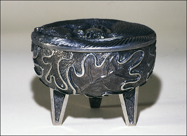
Oakleaf Tripod and Lid
This came about as a result of a discussion with the owner of a craft gallery. I had always wanted to cast some of these tripod containers ever since I first saw some early Chinese bronze tings, (or dings) in the 1970s, but only recently did it occur to me that making a pot lid would require some of the skills of a medallist. It is the most recent of my obsessions, but the last of my circles.
Postscript, 2015
At twenty years' distance this still seems valid as a review of how I arrived at medal making and the early steps I took. Much has changed since then; for one thing I no longer have to cast metals in a bedsit, but now have a decent all-weather studio to work in. Secondly, much of the past fifteen years I have been concentrating on traditional black and white photography, which has reinforced my interest and my understanding of form. My current work seems a lot more plastic and dimensional than before.